How to transfigure wireframes into HTML
by Lara Aigmüller published on
Soon enough in your career as a web developer, you encounter the situation where a designer hands over a wonderful web design in all its large-screen glory. Your mission now is to transform it into code to present a prototype as soon as possible, starting with nothing but an empty text file.
Facts, questions and the truth
This task comes with a few challenges and most of the time there’s no single correct way to do it. In this article, I’m going to describe how I personally approach these tasks.
Our goal for today is to build an HTML prototype for an online newspaper homepage, “The Weekly Prophet”. The only information we have is the following wireframe:
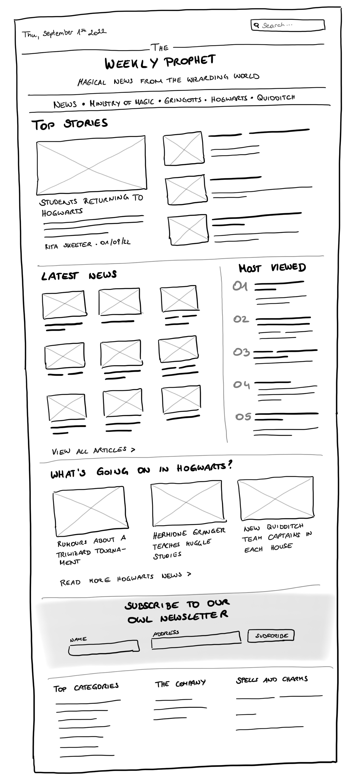
There’s a lot to unpack here.
The first important fact is that in HTML there’s no such thing as placing elements on a page next to each other (we need CSS—Cascading Style Sheets—for that). There’s just one element at a time. When there’s no one-column layout for small screen sizes provided by a designer, we need to define an order of elements on our own.
The next big questions, especially when you’re new to web development, are: where to start now? How do I know which elements I need to build this? How should they be nested?
The truth is, it is probably hard to come up with a final version of the HTML code without ever thinking about CSS and its features, because a lot of markup decisions are based on what CSS can do. As this article is purely about HTML, the outcome is most likely not complete, but a good starting point from a semantics and accessibility point of view.
Semantics and accessibility
HTML might look like an easy-to-learn language, but comes with a lot of (hidden) power. It’s the heart of every web page. The better you understand the meaning and functionality of certain tags and attributes, the better your code will be. Sure, you can build the whole newspaper homepage by just using div and span elements, but that’s not what we’re here for.
We are going to think about…
- the meaning of sections of the page
- the document’s outline and hierarchy of the content
- the interactivity of elements
…because when you build a solid foundation, everything you add on top (i.e., styling with CSS and interaction with JavaScript) will be better. When working with the features HTML gives you and not against them, you can save a lot of time and code (and money) down the road. And as a nice side effect, you automatically build an accessible product that will make your users happy and this is what our work should be all about.
Don’t think outside the box
Enough of the talking, let’s start coding!
Every time I see a web design or a wireframe, I immediately start imagining boxes. On a website, every element is a box, so I start grouping elements that belong together, draw boxes around them, and give them names.
I identified the following eight areas in the wireframe:
- Header
- Navigation
- Section: Top Stories
- Section: Latest News
- Section: Most viewed
- Section What’s going on in Hogwarts?
- Subscription form
- Footer
Sections three to six contain all the interesting articles from the main content of the page.
I don’t start coding a very specific element on the page, but always begin with the overall page structure, the large content elements and then work my way from the outside to the inside.
Step 1: A minimal HTML page starter
I have a very small starter HTML template I always use when creating a new web page from scratch. It looks like this:
<!DOCTYPE html>
<html lang="en">
  <head>
	  <meta charset="utf-8" />
	  <title>Webpage starter</title>
  </head>
  <body>
    <h1>Hello World!</h1>
  </body>
</html>
I’m not going into every little detail here, there are other articles and tutorials about that. We are going to change the page’s title according to the text in the wireframe and focus on the document’s <body> from now on.
<title>The Weekly Prophet – Magical News from the Wizarding World</title>Step 2: Landmarks
Now is the time to place our first content areas we’ve already defined above in our HTML document. The great thing about HTML is that for all these areas we have semantic tags that describe exactly what the specific area means, so let’s make use of them!
<body>
  <header>
	  <h1>
		  The Weekly Prophet
		  <span>Magical News from the Wizarding World</span>
	  </h1>
  </header>
  <nav></nav>
  <main>
	  <section>
		  <h2>Top Stories</h2>
	  </section>
	  <section>
		  <h2>Latest News</h2>
	  </section>
	  <section>
		  <h2>Most Viewed</h2>
	  </section>
	  <section>
		  <h2>What's Going on in Hogwarts?</h2>
	  </section>
  </main>
  <aside>
	  <h2>Subscribe to our Owl Newsletter</h2>
  </aside>
  <footer>
  </footer>
</body>
When using semantic HTML tags like header, nav, main, and so on, we automatically define so-called landmarks, which are subsections of a page with a special role attached to them. This way, screenreader users, for example, can jump from one landmark to another and are enabled to get an overview of the page more quickly.
Sections are only turned into landmarks when giving them an accessible name, for example, by adding IDs to the h2 headlines and using an aria-labelledby attribute on each section referencing the respective title.
<section aria-labelledby="top-stories">
	<h2 id="top-stories">Top Stories</h2>
</section>
Step 3: Reusable sections
Next, I’d like to create the “frame” of the page, that means everything except the main content. The header contains the current date, a search input field, and the title. When I look at the page, the first element that draws my attention is the title, so I would put that first in the HTML code. This way, a screenreader would start reading the title and not the date. I can change the order of elements according to the design later using CSS.
<header>
  <h1>
	  The Weekly Prophet
	  <span>Magical News from the Wizarding World</span>
  </h1>
  <time datetime="2022-09-01">Thu, September 1st 2022</time>
  <input type="search" placeholder="Search…" />
</header>
<nav>
	<!-- see below -->
</nav>
The time element
To provide additional meaning, we can wrap the date with a <time> tag. With the additional datetime attribute we specify the exact date and make the value more accessible to e.g. search engines.
The search field form
The thing about wireframes and screen designs is that not all required HTML elements and attributes might be obvious at first sight. We only see one input field in the top right corner, but there’s a lot more functionality required. Just adding this one field is not enough. The search functionality might be added by JavaScript later, but wouldn’t it be nice if we had a fallback in case this doesn’t work? To achieve that, we need a form that is going to replace the search input from above:
<form action="/search" role="search">
	<label for="search-input">Search articles</label>
	<input type="search" id="search-input" placeholder="Search…" name="q" />
	<input type="submit" value="Submit search" />
</form>
Using CSS, we can hide the elements we don’t want to display while still providing accessible and robust HTML code for everyone. Including an action and a submit button in the form makes it possible to send a search request without no JavaScript involved. The label helps screenreader users find out what the input field is all about—a placeholder cannot replace a label. We use the role attribute to specify a search landmark—this is the only landmark role without a dedicated HTML tag.
The navigation
One center piece of any website is the navigation. It’s a place to start for the user to get an overview of the site and its subsections. To build a navigation, there’s no magic required, just a list of some good old anchor elements a.k.a. hyperlinks.
<nav aria-label="Main">
	<ul>
		<li><a href="/news">News</a></li>
		<li><a href="/ministry-magic">Ministry of Magic</a></li>
		<li><a href="/gringotts">Gringotts</a></li>
		<li><a href="/hogwarts">Hogwarts</a></li>
		<li><a href="/quidditch">Quidditch</a></li>
	</ul>
</nav>
I add an aria-label attribute to the navigation because there will be more nav elements in the footer; we need an indicator to distinguish the purpose of these navigation elements.
The website footer
At the end of the page, we can find a newsletter form and additional navigation content, similar to the header.
<aside>
  <h2>Subscribe to our Owl Newsletter</h2>
  <form action="/subscribe" method="post">
	  <label for="name-input">Name</label>
	  <input name="name" id="name-input" />
	  <label for="address-input">Address</label>
	  <input name="address" id="address-input" />
	  <input type="submit" value="Subscribe" />
  </form>
</aside>
<footer>
	<div>
		<h2 id="footer-categories">Top Categories</h2>
		<nav aria-labelledby="footer-categories">
			<a href="#">...</a>
		</nav>
	</div>
	<div>
		<h2 id="footer-company">The Company</h2>
		<nav aria-labelledby="footer-company">
			<a href="#">...</a>
		</nav>
	</div>
	<div>
		<h2 id="footer-spells">Spells and Charms</h2>
		<nav aria-labelledby="footer-spells">
			<a href="#">...</a>
		</nav>
	</div>
</footer>
The aside tag contains additional content that is not directly related to the main content. I could take it and place it on a different page and it would still make sense. Similar to the search field above, a form is required to collect user data for newsletter subscriptions. Make sure that every input field gets its own meaningful label.
The columns in the footer are wrapped by div elements. They don’t carry any semantic information, but I’m sure I’m going to need this structure later when creating a layout in CSS. I don’t fill the navigations with all the links, but you get the idea.
Using the aria-labelledby attribute, I describe the navigation and its content similar to the aria-label attribute used above. The difference this time is that I use the ID of the describing element—the headlines above in our case—as the attribute value.
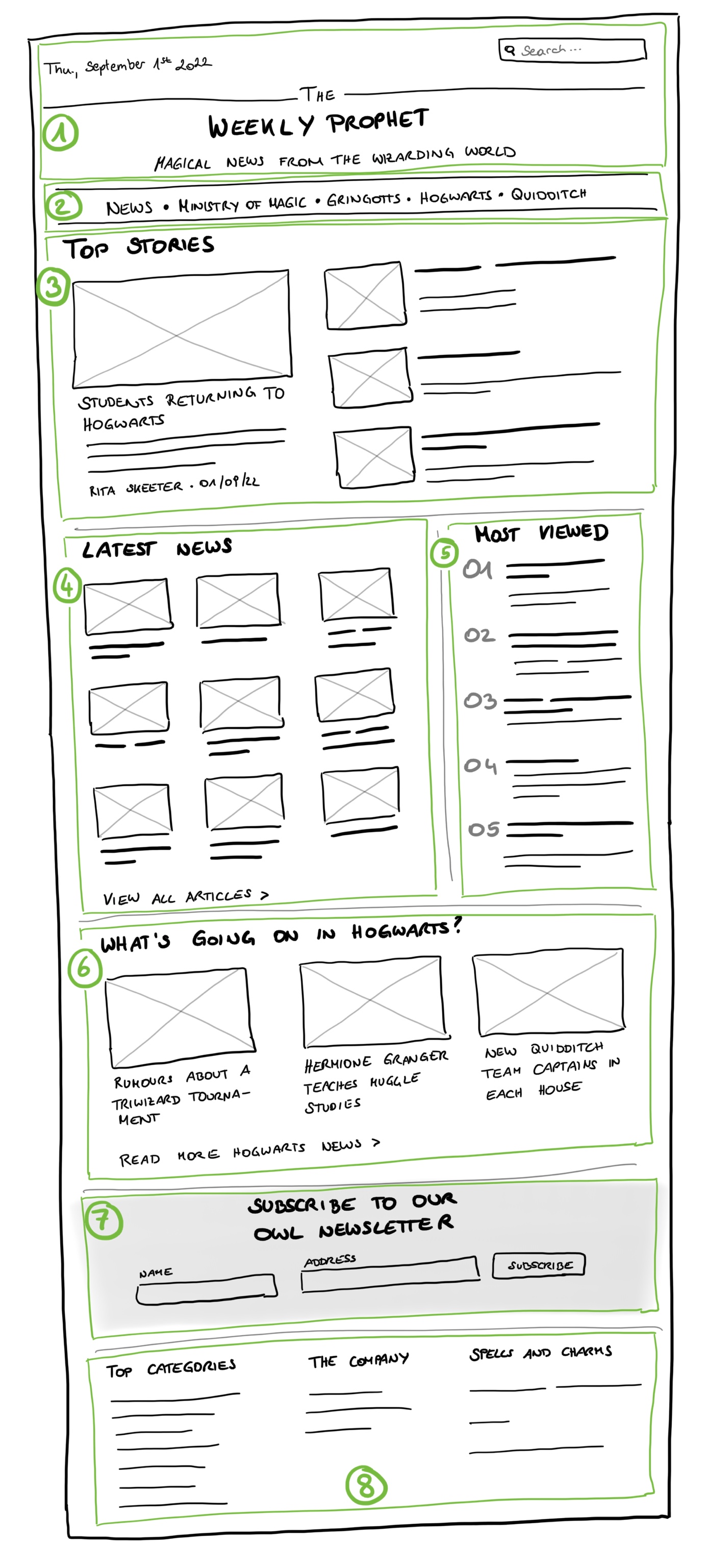
Step 4: Thinking in components
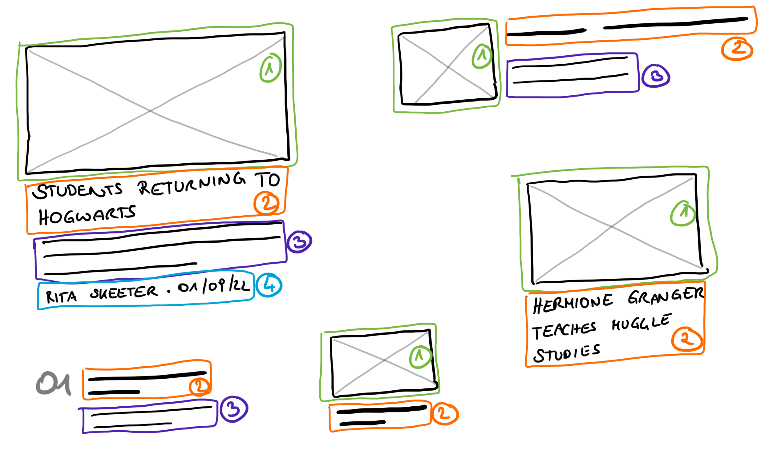
Next, I’d like to focus on the main content: the four sections containing all the interesting articles. Each section looks slightly different, but nonetheless, it’s articles everywhere. They all have a lot in common. In the image below there are all different variants of articles where the same parts are highlighted in the same color:
- title (2)
- image (1)
- teaser text (3)
- author (4)
- date and time (4)
With a lot of libraries, frameworks, and design systems out there, we live in a component-driven web development world. When implementing a design, we try to find out which elements function the same and create reusable components for them. This is what I plan to do for the articles.
The first article in the “Top Stories” section contains all parts listed above, so this is the HTML structure I would use for it:
<article>
  <header>
	  <h3>Students returning to hogwarts</h3>
	  <img src="/path/to/image.jpg" alt="A descriptive alternative text for the image" />
  </header>
  <p>The day 73 kids waited the whole summer long is finally here: there first day at Hogwarts. The Sorting Hat is awaiting them in the castle already…</p>
  <footer>
	  <span>Rita Skeeter</span>
	  <time datetime="2022-09-01">01/09/2022</time>
  </footer>
</article>
All the other articles use a reduced version of the snippet above, depending on the section where they occur. Here are three particularities in the code snippet above I’d like to highlight:
Images and alternative text
Images that provide content should always have a meaningful alternative text that describes what’s in the image. This way, people who are visually impaired can consume the same content just another way. I always try writing good image descriptions right from the beginning to not forget about it when deadlines and launch dates come closer.
A common mistake is to just use the article’s title as alternative text, but it’s not likely that the title describes what can be seen on the image. In case the image is just a decorative item that does not provide any useful content, add an empty alternative text (alt=""), so a screenreader will ignore it.
The document outline
One problem I find on many websites on my daily journeys through the World Wide Web is a wrong order of headlines. People tend to choose the headline level (from one to six) based on the headline’s font size as defined by the user agent’s (the browser’s) style sheet and not their meaning.
In the end, it doesn’t matter whether the h1 headline is smaller than the h3 headline because the page is designed this way; what matters is that when only looking at the headlines on a page (by actually looking at the page or by using a screenreader that only reads the headlines), the user should get an idea of the content and its hierarchy. Imagine writing an article, a thesis, or a book and structuring your content into main sections, chapters, and sub-chapters—it’s the same principle for the web pages you create.
This is why I chose the <h3> tag for the article headline, because the h1 headline is reserved for the page title “The Weekly Prophet” (there should only be one <h1> on a web page), and the h2 headlines are used as headlines for the content sections.
Multiple headers and footers
Unlike the main or the h1 element, it is allowed to have several header and footer elements on a single page. The tags are not reserved solely for the page header and footer, but can be used in sub-components as well to define additional meaning for elements within so-called sectioning content. In our example, the sectioning content element is the article and we define a header for image and title and a footer for the meta information about the author and publish date. In this case, the header and footer aren’t landmarks, but add useful semantic information nonetheless.
Step 5: Last small details
In two of the article sections, we can find additional links to category sub-pages. These should be implemented as simple links.
<a href="/latest-news">View all articles</a>
<a href="/hogwarts">Read more hogwarts news</a>
The wireframe is helpful here, as understandable link texts are already provided. Sometimes you have to work with designs that use just some generic texts for such links like “read more” or similar. When there are a lot of links with the same text on a page, it gets hard to find out where these links lead to without further context. Make sure to always provide meaningful link texts that tell the user what to expect when clicking on it.
One more thing
The section about the most viewed articles is about ranking. Therefore, I’d use an ordered list to wrap the articles that show up there.
<section>
	<h2>Most Viewed</h2>
	<ol>
		<li>
			<article><!-- article content ---></article>
		</li>
		<li>
			<article><!-- article content ---></article>
		</li>
		<!-- and so on… -->
	</ol>
</section>
Wrapping up
That’s it, we’re done, we’ve built a fundamental HTML structure based on the given wireframe. 🎉
Here are my key takeaways for you:
- always remember to use available semantic HTML tags to define the content’s meaning
- use only one
h1andmaintag per page - take care of proper headline order, count from one to six and don’t skip levels
- provide descriptive alternative texts for images (or leave the alt attribute empty when the image is just decorative)
- use built-in functionality like links and forms for the user to interact with your site
To make sure there are no syntax or semantic errors in your code, I recommend using tools like the W3C validator to run a quick check on your code. Sometimes you get helpful insights about what’s wrong and how to fix it.
It’s not that hard to take responsibility for building good HTML and consequently an accessible site, you can start with small first steps and make your way to the top from there.
About Lara Aigmüller
Lara is a software developer at scale.at always striving for great user experience. She wants to make the web a better place while always improving her knowledge about the ins and outs of HTML and CSS. Find more articles by Lara on the scale Blog and follow @scale_www on Twitter
scale Blog: scale.at/blog
scale on Twitter: @scale_www