One day we'll have a fully customisable select
by Hidde de Vries published on
Today, I want to look at a proposed HTML feature that may end up replacing a lot of <div>s-based custom input components: <selectmenu>.
CSS is awesome
I realise this calendar is about HTML. And I'll get to that. But first, let me start with CSS. CSS is fantastic, because it has allowed us to decide what our websites look like for over 25 years. This wasn't a given. Before CSS, you could only define the structure of your pages and browsers would decide their appearance.
Fast-forward to today, CSS not only exists, it has become extremely versatile. We have grids, custom properties, transforms and much more, and it is all pretty compatible across different browsers. The basic principle of CSS stays: styles are hints. What websites look like is a combination of the preferences of users, browsers and web developers.
But maybe in your design system, your select has a very specific style. Shadows around the listbox, brand-specific whitespace settings… or your select contains more than just strings of text, like flags with country names or avatars with user names. The <select> element won't let you go that far with CSS. Enter <selectmenu>.
The parts of <selectmenu>
The <selectmenu> element is a new HTML element proposed by the Open UI Community Group. It has not yet landed in the HTML Specification, but it is being prototyped in Chromium. You can test it by turning the “Experimental Web Platform Features” flag on (go to about:flags and search for this flag).
When you use a <selectmenu>, you'll find it is comprised out of different parts:
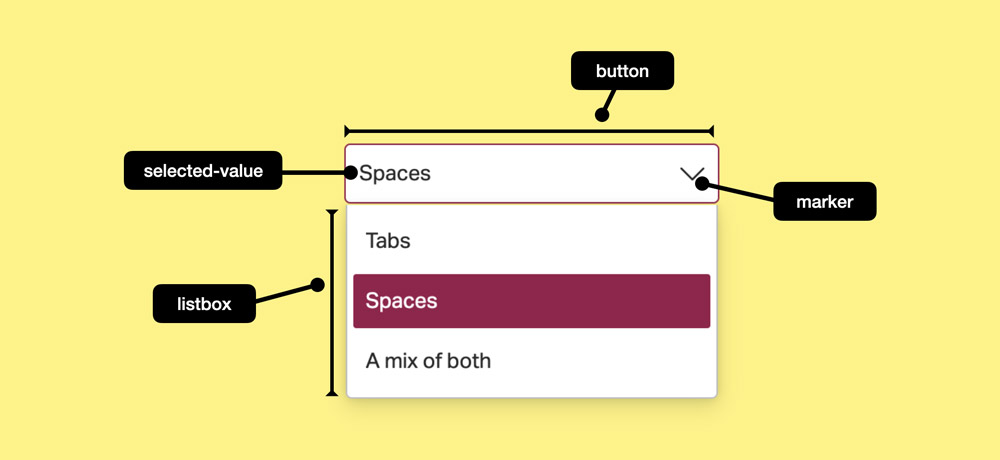
<select>- the root element<button>- the button you click to open the select<selected-value>- the currently selected value<marker>- the arrow that is in the button<listbox>- the popover that opens when you click the button<option>- the options within the listbox (just like in regular<select>)<optgroup>- an optional way of grouping options (just like in regular<select>)
From: Anatomy of the selectmenu
Styling <selectmenu>
Styling parts
In CSS Shadow Parts 1, currently a Working Draft (eg not yet a full-blown standard), a new pseudo element is introduced to allow styling parts of shadow roots: ::part().
Wait, wasn't Shadow DOM something Web Components-specific? Yes. But how <selectmenu> is implemented in the browser, is kind of Web Component-like. You could see it as a Web Component that ships with the browser.
With ::part, you can style the different parts as they are described above, for instance, to style the listbox, you would do:
selectmenu::part(listbox) {
  box-shadow: 3px 3px 3px 3px hotpink;
}
Or maybe you want to change what the arrow looks like:
selectmenu::part(marker) {
  box-shadow: 3px 3px 3px 3px hotpink;
}
(The <marker> is not yet added to the selectmenu explainer, but it was confirmed in an Open UI meeting
Styling states
You will also be able to style a selectmenu based on whether it is open or closed, using the :open pseudo class:
selectmenu {
  border: 2px solid black;
}
selectmenu:open {
  border-color: hotpink;
}
Or maybe you want a different marker when it is open:
selectmenu::part(marker) {
// regular
}
selectmenu::part(marker):open {
// open
}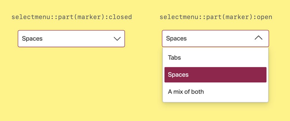
Different icons on opened and closed states
There will also be a :closed pseudo class, to style the closed state. It would be equivalent to :not(:open). The :open and :closed pseudos are defined in the Element Display State section of Selectors, Level 4.
Customising beyond just styling
You can also replace the parts shown above with random markup of your own. The parts shown above are exposed as “slots”, meaning you can add your own tree structure in your markup and use that to replace a part.
For instance, this is how you would replace the icon with something else:
<selectmenu>
  <div slot="marker">
    <!-- your own selectmenu open icon goes here -->
  </div>
</selectmenu>
This uses whatever is inside this div instead of the default marker in the button to open a selectmenu.
In principle, <selectmenu> will allow you to do things like this with each of the parts, so that you could replace the button or the options. This gives developers a lot of power, and with that comes responsibility. So a word of warning: nesting the wrong kind of elements into parts can quickly lead to a “HTMHell”. For instance, what if you put more than just text inside of an option—say, avatars—but browsers and assistive technologies expect just text? Or what if you put a button in an option? Nested interactive elements like that risk breaking the experience for end users, in ways that the browser or assistive technologies can't magically fix, so beware.
Current status
Selectmenu is currently being “incubated” at the Open UI Community Group and prototyped behind a flag in Chromium.
What about other browsers and browser engines? I'm not sure what will happen in Safari or Webkit, but folks from Firefox (Mozilla) join the Open UI calls. Quoting from the “The Declarative Web” part of Mozilla's vision for the open web:
[on the web, built-in controls are] often insufficiently styleable and have inconsistent internal structures across browsers, which makes it difficult to make them visually consistent with the rest of the Web page. We want to fill these gaps, and are pleased to see the OpenUI effort already making progress in this space.
For <selectmenu> to become a reality, it would need to go into the standards and then get browser implementations. At this time, it's hard to say when that will be the case.
Summary
So, in summary: <selectmenu> is a new proposal that would add a new control to the web platform that is like <select> by default, but can be styled and customised in pretty much any way you want. I'm particularly excited about the ability to use ::part() to style parts, and slightly worried about the ability to replace parts completely as that may break accessibility if it is replaced with the wrong things.
You can play with <selectmenu> today in Microsoft Edge Canary or Google Chrome Canary and file issues against the Open UI repository.
About Hidde de Vries
Hidde is a web developer and accessibility specialist from Rotterdam, The Netherlands. He participates in the Open UI Community Group, works at Sanity.io in their developer relations team and is excited about web standards, HTML, CSS, JavaScript and accessibility. Hidde writes about these things and more on hidde.blog.
Website/blog: hidde.blog
Mastodon: front-end.social/@hdv