Reading the meter
by Dana Byerly published on
The <meter> element is a little known and rarely used semantic element. It's a non-interactive form element that renders as a partially filled horizontal bar. Browsers provide user-agent styles, but the <meter> element can also be styled.
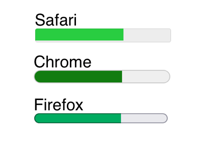
<meter min="10" max="200" value="130"></meter>The example above in Safari, Chrome and Firefox on MacOS.
<meter> is sometimes confused with the <progress> element as they are visually similar, but <meter> represents a current value in a known range, while <progress> represents something that is in progress, like a file upload.
The definition found in the HTML spec includes some examples of potential uses.
The meter element represents a scalar measurement within a known range, or a fractional value; for example disk usage, the relevance of a query result, or the fraction of a voting population to have selected a particular candidate.
The spec also states that it should not represent an arbitrary range, meaning there should be a known maximum value.
Attributes
Six attributes determine how the <meter> element renders and its basic semantics. The only required attribute is value, and all attributes must be a valid floating point number (e.g., 5, -22, 7.25).
The following attributes set the value and range.
value- Current value. Must be betweenminandmax. It can be the only attribute if it's expressed as a decimal fraction (e.g., 0.65, which would represent 65%).min- Minimum value for the range. Must be less thanmax. Defaults to 0 if not specified.max- Maximum value for the range. Must be greater than thanmin. Defaults to 1 if not specified.
The following attributes set boundary segmentation. The bar can render in different colors based on their value. They also can provide additional semantic information for screen readers to announce.
low- Upper boundary of the low end of the range, or where the low range ends. Must be greater thanminand less thanhighormax.high- Lower boundary of the high end of the range, or where the high range begins. Must be less thanmaxand greater thanlow.optimum- Indicates the optimum point in the range. If unspecified, the midpoint between minimum and maximum values is the optimum.
A summation from the HTML spec ...
- minimum value ≤ actual value ≤ maximum value.
- minimum value ≤ low boundary ≤ high boundary ≤ maximum value.
- minimum value ≤ optimum point ≤ maximum value.
All of the following are valid:
<meter value=".65"></meter>
<meter max="100" value="10"></meter>
<meter min="20" max="100" value="30"></meter>
<meter low="30" max="100" value="35"></meter>
<meter min="1" max="100" low="30" high="80" optimum="85" value="20"></meter>
Semantics and labeling
Authors are encouraged to include a textual representation of the gauge's state in the element's contents, for users of user agents that do not support the <meter> element. – HTML specThere are several screen readers in use today, and without access to all of them it's hard to know how well <meter> is supported.
According to a survey of screen reader users by WebAIM released in 2021, the most commonly used desktop/laptop screen readers among respondents were JAWS and NVDA, and the most commonly used mobile screen reader was VoiceOver. On desktop/laptop the most common browser and screen reader combinations were JAWS and Chrome (32.5%) and NVDA and Chrome (16%).
In 2018 Scott O'Hara tested and documented the effect of styling on the <meter> element:
JAWS 2018 + Chrome (latest) — Chrome + JAWS will announce both styled and unstyledmeterelements and their current value, with no indication of their low, high, or max values. If ameteris provided an accessible name by `aria-label` oraria-labelledby, it will be completely ignored by JAWS.
NVDA 2018.2.1 + Chrome (latest) — Chrome + NVDA do not have issues with announcing styled meters unless they are given an accessible name via aria-label or aria-labelledby. Doing so will result in NVDA only announcing the accessible name and none of the meter's current state.
NVDA 2018.2.1 + Firefox 63 (nightly) — NVDA will announce nothing but the accessible name to meter elements, regardless of if they are styled or not.
VoiceOver + Safari 11.1.1 & 12.0 on macOS High Sierra — VoiceOver will completely ignore a styled meter element unless it has an accessible name set by aria-label or aria-labelledby. But even then, VoiceOver will only announce the accessible name and none of the meter's current state.
VoiceOver + Safari on iOS 11.4 & 12.1 — VoiceOver will completely ignore the existence of meter elements, regardless of if they are styled or not.
Using NVDA and Narrator via Assistiv Labs and VoiceOver with Safari on MacOS and iOS we can we can see if support for the <meter> element has improved since 2018. The tests below use the following versions of screen readers and browsers:
- NVDA (2022.3) + Chrome (106)
- NVDA (2022.3) + Firefox (105)
- Narrator (21H2) + Edge (106)
- VoiceOver + Safari MacOS 15.6.1
- VoiceOver + Safari iOS 15.6.1
Narrator (Windows) and VoiceOver (Mac) are included in their respective operating systems and NVDA is a free open source screen reader available for Windows. JAWS is paid screen reader for Windows and is not included in these tests.
Using our original example:
<meter value=".65"></meter>
<meter max="100" value="10"></meter>
<meter min="20" max="100" value="30"></meter>
<meter low="30" max="100" value="35"></meter>
<meter min="1" max="100" low="30" high="80" optimum="85" value="20"></meter>- NVDA + Chrome announces "progress bar" + the value (e.g, "progress bar .65", "progress bar 10").
- NVDA + Firefox announces "progress bar" + the value (e.g, "progress bar .65", "progress bar 10").
- Narrator + Edge announces the value as a percent + "meter" (e.g., "65% meter").
- VoiceOver MacOS announces the value as a percent + "level indicator" if
minand/ormaxare the only attributes present (e.g., "65%, level indicator). Iflow,high, oroptimumare present the value is announced as "critical value", "suboptimal value" or "optimal value" + "level indicator" (e.g., "optimal value, level indicator"). - VoiceOver iOS announces the same as MacOS but does not include "level indicator" (e.g., "65%", "optimal value").
- None of them explicitly announce the
min,max,low,highoroptimumvalues.
Fallback text
Using fallback text within the <meter> is the textual representation mentioned in the spec. Adding fallback text to our original example:
<meter value=".65">65% complete</meter>
<meter max="100" value="10">10 out of 100</meter>
<meter min="20" max="100" value="30">30/100</meter>
<meter low="30" max="100" value="35">35 out of 100 items</meter>
<meter min="1" max="100" low="30" high="80" optimum="85" value="20">20 centimeters long out of 100 total</meter>- NVDA + Chrome ignores fallback text and announces value only (e.g, "progress bar .65", "progress bar 10").
- NVDA + Firefox announces progress bar + fallback text (e.g., "progress bar 65% complete").
- Narrator + Edge ignores fallback text and announces value only (e.g., "65% meter").
- VoiceOver MacOS announces fallback text + level indicator if
minand/ormaxare the only attributes present (e.g., "65% complete, level indicator"). Iflow,high, and/oroptimumare present the fallback text is announced + "critical value", "suboptimal value" or "optimal value" + "level indicator (e.g., "20 centimeters long out of 100 total, critical value, level indicator"). - VoiceOver iOS announces the same as MacOS but does not include "level indicator" (e.g., "65% complete").
In addition to NVDA + Chrome and Narrator + Edge, fallback text is also not announced in NVDA + Edge and MacOS + Chrome. Support for the feature likely comes from the browser engine rather than the screen reader given that both Chrome and Edge use Blink.
Labeling
Labeling can provide additional information or meet the requirements of your use case (e.g., you need a visible label). Using our original example and adding various labeling techniques:
<label for="meter-1">Tasks</label>
<meter id="meter-1" value=".65"></meter>

<meter max="100" value="10" aria-label="cookies eaten">10 out of 100</meter>

<meter min="20" max="100" value="30" title="articles written">30/100</meter>

<p id="meter-2">Shows watched</p>
<meter low="30" max="100" value="35" aria-labelledby="meter-2"></meter>

<p id="meter-3">Length in centimeters</p>
<meter min="1" max="100" low="30" high="80" optimum="85" value="20" aria-describedby="meter-3"></meter>- NVDA + Chrome announces all labeling techniques (e.g., "Tasks, progress bar 0.65").
- NVDA + Firefox announces all labeling techniques (e.g., cookies eaten, progress bar 10 out of 100).
- Narrator + Edge announces all labeling techniques (e.g., "articles written, 13% meter")
- VoiceOver MacOS announces all labeling techniques except
title(e.g., "30/100, level indicator" without announcing "articles written"). - VoiceOver iOS announces all labeling techniques including
title. - Using
labeloraria-labeladded a double announcement of the label (e.g., "Tasks, 65% complete, tasks, level indicator" or "Tasks, Tasks 65% meter") for VoiceOver and Narrator.
There have been a few of improvements in screen reader support for the <meter> element since 2018.
- NVDA as of version 2020.4 using an accessible name (
aria-labeloraria-labeledby) no longer voids announcement of the<meter>'s state. - VoiceOver on iOS no longer ignores an unstyled
<meter>element.
It's unknown if accessible names still cause JAWS to ignore the content of the <meter> element.
Color Contrast
Browsers provide user-agent styles for the <meter> element, and each browser uses slightly different colors. Generally the default colors don't provide sufficient contrast against a white background to pass Web Content Accessibility Guidelines (WCAG) AA 2.1 standard of at least a 3.1 contrast ratio between graphical elements and adjacent colors (success criterion 1.4.11 non-text contrast). A black or very dark background is the best bet for color contrast using the default styling.
Keep in mind there can be variations between operating systems and displays, as well as browsers. My machine (2017 iMac 5k retina with default calibration) produced the following results (Google sheet with hex colors and contrast ratios):
- Black background
- Chrome, Firefox, Safari - all three color passed.
- White background
- Chrome - green and red passed, yellow failed.
- Firefox - red passed, green and yellow failed.
- Safari - all three colors failed.
Other items of note:
- Firefox provides borders that have at least 3.1 contrast ratio against a white background, but don't meet that contrast threshold with the adjacent fill color.
- In Safari the unused portion of the bar is transparent against a dark background.
- Using Windows High Contrast Mode the
<meter>bar fill rendered using the "selected text" color regardless of whether or not it was styled.
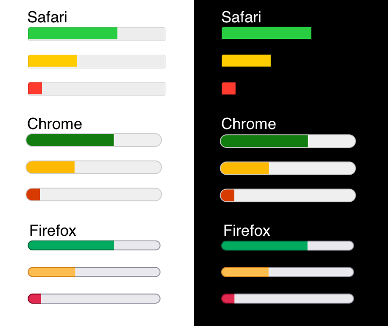
Using optimum to render different colors
When using a combination of min, max and value the bar color will be green regardless of the value. When including any combination of low, high and optimum the bar colors can be changed without any additional styling.
When used with thelowattribute andhighattribute, it gives an indication where along the range is considered preferable. For example, if it is between theminattribute and thelowattribute, then the lower range is considered preferred. The browser may color the meter's bar differently depending on whether the value is less than or equal to the optimum value.
An example:
<!-- Bar colors: yellow, green, yellow -->
<meter min="0" max="100" low="30" high="80" value="20"></meter>
<meter min="0" max="100" low="30" high="80" value="40"></meter>
<meter min="0" max="100" low="30" high="80" value="90"></meter>

<!-- Bar colors: red, yellow, green -->
<meter min="0" max="100" low="30" high="80" optimum="85" value="20"></meter>
<meter min="0" max="100" low="30" high="80" optimum="85" value="40"></meter>
<meter min="0" max="100" low="30" high="80" optimum="85" value="90"></meter>

<!-- Bar colors: green, yellow, red -->
<meter min="0" max="100" low="30" high="80" optimum="10" value="20"></meter>
<meter min="0" max="100" low="30" high="80" optimum="10" value="40"></meter>
<meter min="0" max="100" low="20" high="80" optimum="10" value="90"></meter>It's best to play around with your values to see how it behaves, but generally
- Using only
lowandhighwill render orange/amber or green. - Adding
optimumcan additionally render red.
Daniel Aleksandersen discovered browsers can render the segment boundaries differently depending on how they interpret the spec.
Firefox’s implementation is consistent: the values of the attributes are excluded from the segments with the same name (exclusive). Like Firefox, Chrome and Safari exclude thelowattribute value from the low segment. Unlike Firefox, Chrome and Safari include thehighattribute value in the high segment (inclusive).
There's a bug filed against the spec to call for clarification. In the meantime he's also discovered a workaround if you encounter the issue.
Styling
Considering contrast issues, potential rendering differences or the needs of your use case you may want to style the <meter> element.
In 2013 CSS Tricks created a comprehensive post that still seems to be considered the go-to for <meter> styling. A more recent post at UI Pencil has a straightforward bar color, shape and size example. Creating the example from that post at CodePen allowed for screenreader testing to see how styling might impact screen reader support.
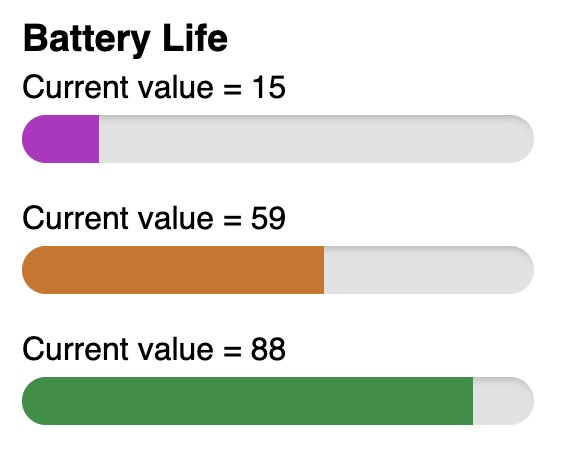
<h2>Battery Life</h2>
<p>Current value = 15
  <meter value="15" min="0" max="100" low="20" high="80" optimum="100">
    15% battery remaining
  </meter>
</p>
<p>Current value = 59
  <meter value="59" min="0" max="100" low="20" high="80" optimum="100">
    59% battery remaining
  </meter>
</p>
<p>Current value = 88
  <meter value="88" min="0" max="100" low="20" high="80" optimum="100">
    88% battery remaining
  </meter>
</p>- NVDA + Chrome styling has no effect, announces "progress bar" + value (e.g., "Current value = 15, progress bar 15").
- NVDA + Firefox styling has no effect, announces "progress bar" + fallback text (e.g., "Current value = 15, progress bar 15% battery remaining").
- Narrator + Edge styling has no effect, announces value as percent + meter (e.g., "Current value = 15, 15% meter").
- VoiceOver MacOS ignores the
<meter>when styled, including fallback text (e.g., "Current value = 15"). Will announce an accessible name (e.g.,aria-label) but add "empty group". - VoiceOver iOS ignores the
<meter>when styled, including accessible name (e.g.,aria-label). - Including an accessible name had no negative impact on NVDA and Narrator.
The example above includes the text labels as <p> tags. Including the value in this way worked well for VoiceOver as it only announced the text (e.g., Current value = 15). The downside of this approach is that it added a bit of verbosity for NVDA and Narrator.
Use case examples
The previously mentioned 2013 CSS Tricks article has a disk space usage example and accompanying CodePen. It's a good example of extending the <meter> element with styling while supporting people using assistive technology. The <meter> element semantically communicates the total disk usage while being styled to visually display the segments (audio, movies, photos, apps, other). If the <meter> information is not announced the adjacent text and unordered list ensures all the vital information is communicated.
Leslie Cohn Wein posted about a recent budgeting use case where talking through the scenario helped to clarify the semantics between <meter> and <progress>, and for her use case <meter> was the better choice.
Lea Verou recently posted about attempting to use the <meter> element for star ratings, and her explorations for creating a web component that's still a work in progress. Sven Wolfermann also created a star rating example at CodePen inspired by Verou's work.
Should you use the <meter> element?
On first glance the <meter> element might seem straightforward for accessibility given that it's a semantic element, but testing has shown the support is not uniform.
If you're building something for an internal team where the all of the devices, browsers and assistive technology in use are known, you're likely to be in a much better position to make the <meter> element accessible to all. If you're building for a wider audience it's tougher to ensure.
Given the lack of sufficient contrast against light backgrounds, styling the <meter> element with at least a 3.1 contrast ratio against the background or adjacent colors is a good approach. Styled <meter> elements have relatively good support for desktop/laptop, but VoiceOver on iOS, a popular mobile screen reader, ignores the <meter> when styled.
Using visually hidden text instead of fallback text or accessible names presents an option that can make using the <meter> element more accessible, regardless of whether or not it's styled.
<p>
 <meter min="0" max="100" value="65"></meter>
 <span class="visually-hidden">65 out of 100 items</span>
</p>
<p>
 <meter min="1" max="100" low="30" high="80" optimum="85" value="20"></meter>
 <span class="visually-hidden">20 centimeters long out of 100 total</span>
</p>Above code not styled:
- NVDA + Chrome announces "progress bar" + value + text (e.g., "progress bar 65. 65 out of 100 items").
- NVDA + Firefox announces "progress bar" + value + text (e.g., "progress bar 65. 65 out of 100 items").
- Narrator + Edge announces value as a percent + "meter" + text (e.g., "65% meter. 65 out of 100 items").
- VoiceOver + MacOS announces value as percent + "level indicator" + text (e.g., "65% level indicator. 65 out of 100 items").
- VoiceOver + iOS announces value as percent + text (e.g., "65%. 65 out of 100 items").
Above code styled:
- NVDA + Chrome announces "progress bar" + value + text (e.g., "progress bar 65. 65 out of 100 items").
- NVDA + Firefox announces "progress bar" + value + text (e.g., "progress bar 65. 65 out of 100 items").
- Narrator + Edge announces value as a percent + "meter" + text (e.g., "65% meter. 65 out of 100 items").
- VoiceOver + MacOS announces only text (e.g., "65 out of 100 items").
- VoiceOver + iOS announces only text (e.g., "65 out of 100 items").
This approach ensures announcement for mobile VoiceOver users and provides more consistently supported announcement than fallback text, albeit at the expense of some verbosity.
One issue to note with this approach is that there's a pause between the <meter>'s content and visually hidden text for the combinations that announce both. This may be confusing and not achieve the goal if it's unclear that the <meter>'s content and visually hidden text are related. Testing with screen reader users would help to clarify if this approach works.
Conclusion
In 2018 Scott O'Hara said of the <meter> and <progress> elements...
Unfortunately, neither of these elements are consistently accessible to screen readers. Styling each can actually make them even more inaccessible
There have been improvements since his initial tests, but there are still inconsistencies and unknowns. And styling can still render the <meter> inaccessible for VoiceOver + Safari on MacOS and iOS.
If you are going to use the <meter> element, use it with caution and keep these things in mind:
| Screen reader + browser | Announces fallback text | Announces accessible name | Styling breaks announcement | Announces extra information based on high, low, optimum |
|---|---|---|---|---|
| NVDA + Chrome | No | Yes | No | No |
| NVDA + Firefox | Yes | Yes | No | No |
| Narrator + Edge | No | Yes | No | No |
| VoiceOver + Safari MacOs | Yes unless styled | Yes including when styled | Yes | Yes |
| VoiceOver + Safari iOS | Yes unless styled | Yes unless styled | Yes | Yes |
- Don't assume the
<meter>element's semantics are uniformly supported or announced across screen readers. - Pay attention to contrast. When using default colors a dark background is best.
- If you're supporting light and dark mode or themes, make sure your
<meter>bar fill colors work across the board. - If styling, assume it will break or nullify semantic support for assistive technology and provide semantic information (e.g., value, additional labeling) using methods with broad support.
- Accessible names (
aria-label,aria-labeledby) may cause some screen readers to ignore the<meter>element content and only announce the accessible name (source - JAWS, and potentially other screen readers not tested here). - As always, it's best to test with a screen reader, and if you can hire screen reader users to test, even better.
Resources
- HTML Spec
- MDN
- Styled Meter Accessibility Tests 2018
- The HTML meter element and it's (undefined) segment boundaries
Special thanks
Many thanks to Eric Bailey for reviewing this post. His thoughtful feedback notably improved the outcome and increased my understanding. And a special thank you to Manuel Matuzovic for his unwavering dedication to saving us all from HTMHell.
About Dana Byerly
Dana Byerly is an interaction designer and front of the front-end developer with over 20 years of experience. She believes the web is for everyone and enjoys creating websites with her favorite design tool, HTML and CSS.
Website: danabyerly.com
Website: @superterrific@mastodon.social
Pixelfed: pixelfed.social/superterrific
Twitter: @superterrific