Template for accessibility guidelines
by Steve Frenzel published on
Foreword
This template is opinionated and intended as a starting point for those who want to define how accessibility is dealt with in their company. It does not matter whether your title is developer, designer, project manager or something else.
I created it based on my experience working with a very small start-up, a digital agency with more than 250 employees and a monolithic company with very fixed structures.
When creating this template, I had the six most common WCAG failures in mind, but also what processes take place when you collaborate with other people. Nothing is set in stone and it should be adapted in consultation with your colleagues, because accessibility is a group effort! More on that in Prependix.
As a reference, I refer to the Web Content Accessibility Guidelines (WCAG) 2.2, as they are popular and well documented. However, you are free to include a different one or more in this template, depending on your location and the requirements that need to be met.
With all that being said, let's have a look at the template! 👀
Table of contents
- Prependix
- Design
2.1 Color contrast
2.2 Font size
2.3 Touch target size
2.4 Conveying meaning
2.5 Focus behaviour
2.6 Media controls
2.7 User flow
2.8 Landmarks & annotations
2.9 Handover - Development
3.1 Semantic HTML
3.2 Skip link
3.3 Heading levels
3.4 Typography
3.5 Buttons & anchors
3.6 Alternative text
3.7 Operability
3.8 Preference detection - Testing
4.1 Browsers
4.2 Browser extensions
4.3 Screen reader
4.4 Pipeline integration
4.5 Other apps & tools - Appendix
1. Prependix
To ensure that our products are usable and accessible, we comply with level AA success criteria of the Web Content Accessibility Guidelines (WCAG) 2.2. For a better understanding of these guidelines, check out the following resources:
- WCAG, but in language I can understand by tempertemper
- WCAG 2.2 Map by Intopia
- Accessibility Not-Checklist by Intopia
Accessibility is a group effort and not a one-person show. It goes beyond leaving it to designers or developers. Being aware and curious about it will not only help you, but also the people around you.
It is not possible to create a product that is 100% accessible. However, this is no reason to give up or to not start at all. “Progress over perfection” is our approach, because every little improvement counts and will make someone’s life easier.
You're never done with accessibility. Wether you're just starting your journey, or maintaining a current project: People (and their needs) are constantly changing, as well as technology, so you'll need to pay attention and adapt accordingly. If you want to get a better understanding of this particular topic, check out Microsoft Inclusive Design.
2. Design
Whenever possible, we want to not only meet the minimum for level AA success criteria, but also go beyond that. It is therefore possible that there is no direct WCAG recommendation for some of our requirements.
2.1 Color contrast
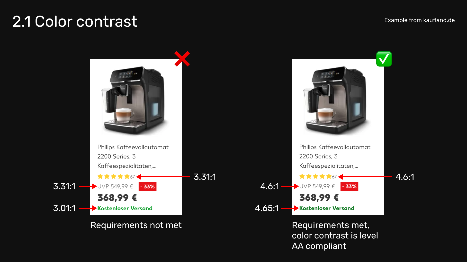
Color contrast must be level AA, if possible level AAA compliant. If text is in front of an image, provide a layer in between.
Related WCAG recommendation: Success Criterion 1.4.3 Contrast (Minimum)
2.2 Font size
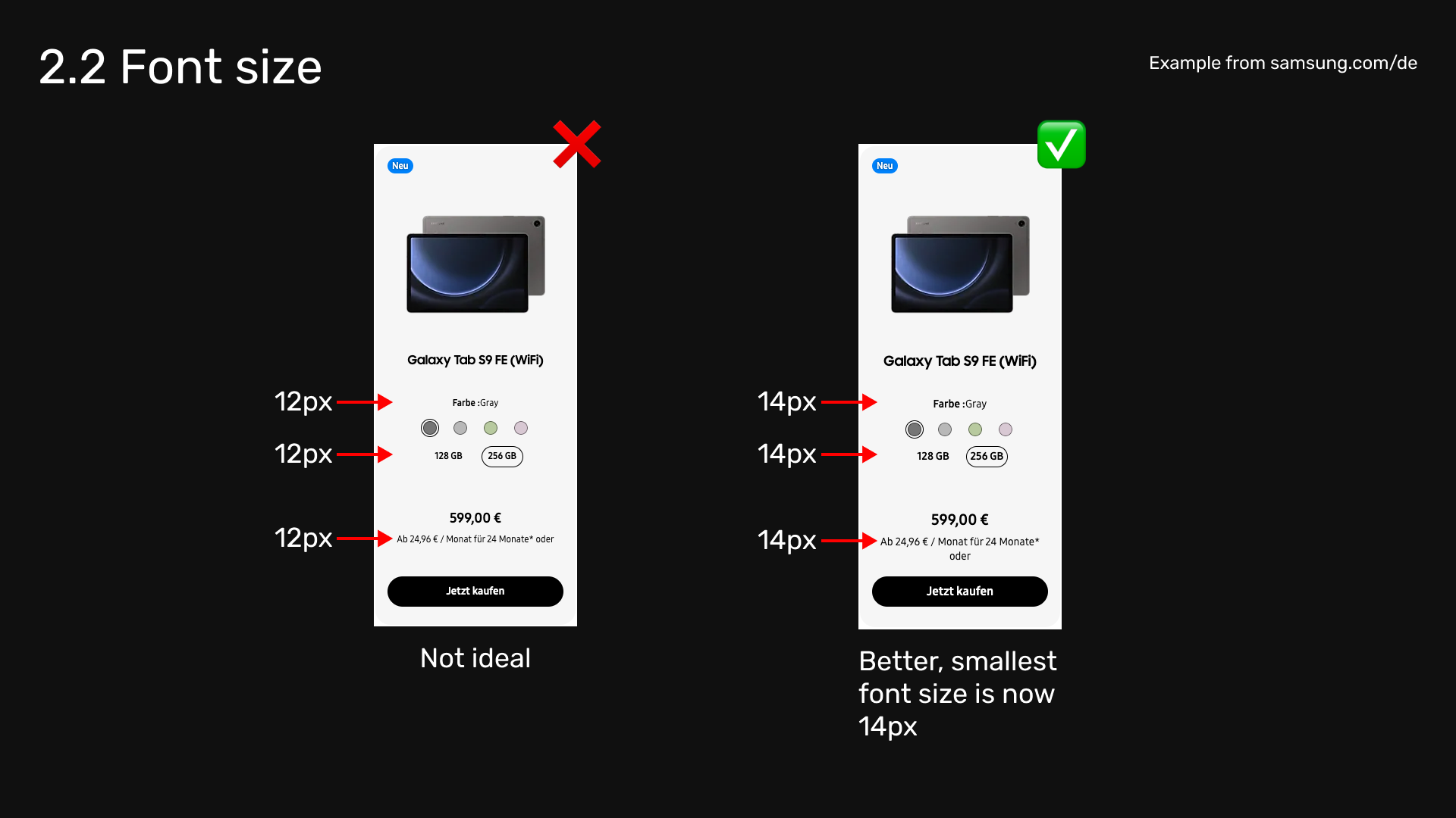
Font size is at least 14 pixels, preferably 16 pixels.
No related WCAG recommendation, this is based on real life experience.
2.3 Touch target size
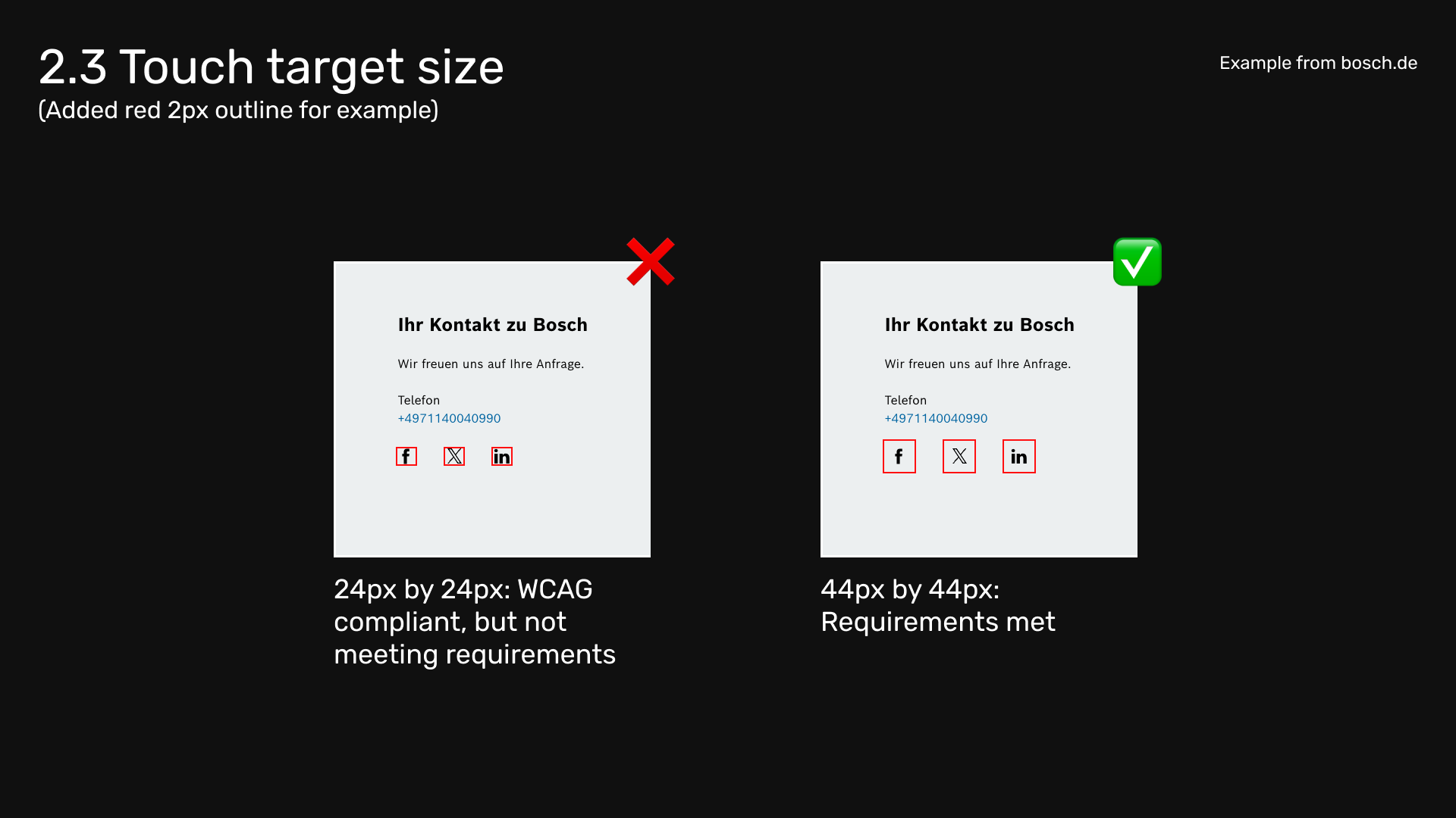
Touch target size should be at least 44 x 44 pixels, preferably more.
Related WCAG recommendation: Success Criterion 2.5.5 Target Size (Enhanced)
2.4 Conveying meaning
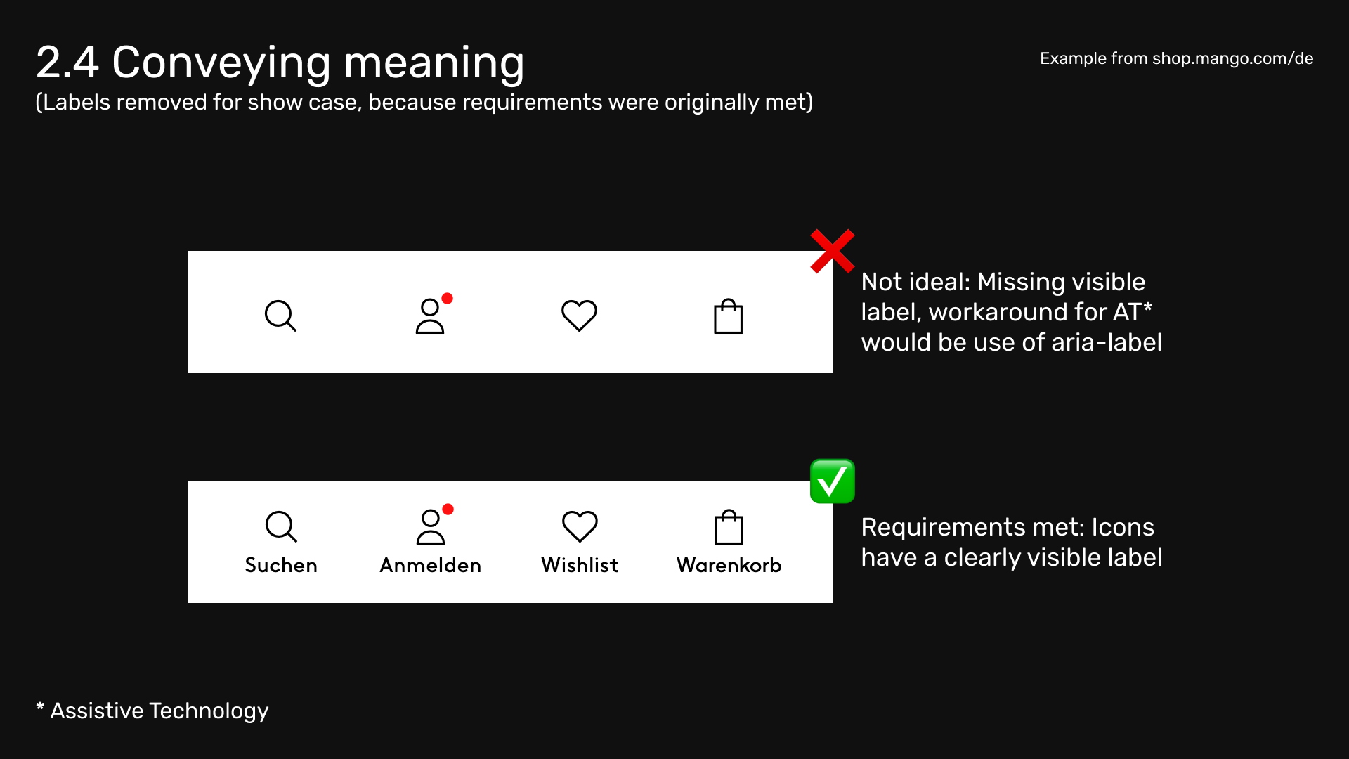
Convey meaning not only through colors or icons. If possible, add a descriptive label to the element in question.
Related WCAG recommendation: Success Criterion 1.4.1 Use of Color
2.5 Focus behaviour
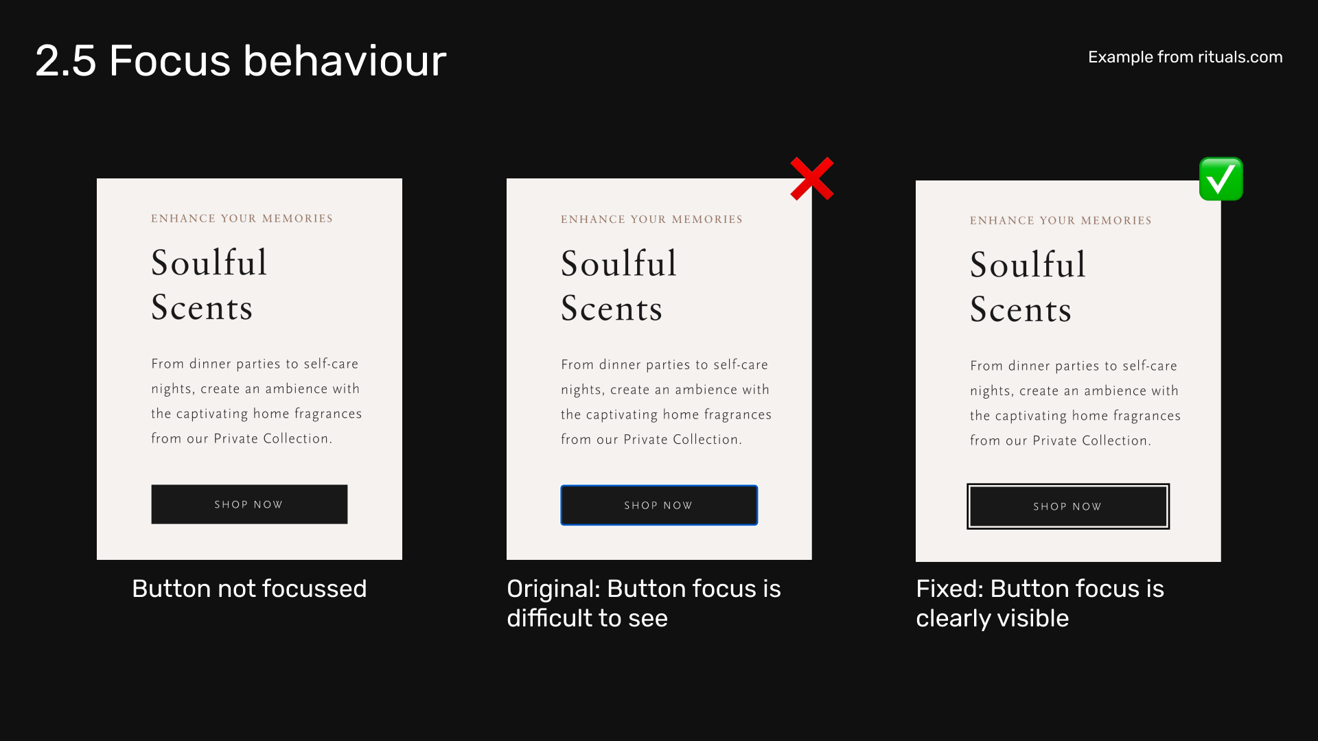
All interactive elements have a clearly visible focus state. It might be a change of background and font color, or a focus ring. If the latter, it should have a width and offset of at least 2 pixels.
Related WCAG recommendations:
- Success Criterion 2.4.7 Focus Visible
- Success Criterion 1.4.11 Non-text Contrast
- Success Criterion 2.4.11 Focus Not Obscured (Minimum)
2.6 Media controls
When creating components such as carousels (sometimes called sliders) or any sort of media player, make sure it has controls to:
- Navigate to the next or previous item
- Stop and start the media
- Show or hide captions (if applicable)
Related WCAG recommendation:
2.7 User flow
When visualising how users interact with a certain feature or component, keep in mind they will not only use a mouse. They might also use a keyboard, screen readers or other assistive technologies. So ask yourself: Can this (thing I'm working on) be used by anyone at any time? Is there something that might exclude certain people?
Related WCAG recommendation: Operable
2.8 Landmarks & annotations
Provide a version of your design with landmarks and accessibility annotations. This will help communicating with developers and improve accessibility across all browsers. You can find plenty of resources regarding this topic (and much more) in Stephanie Walter's Designer’s Guide to Documenting Accessibility & User Interactions.
2.9 Handover
A design is only ready for development, if it has been approved by at least one other member of your team (Note by the author: This could be a developer, another designer, quality assurance, accessibility expert, or whoever else might be responsible). Before moving on, all open issues must be resolved.
(Note by the author: All things mentioned are supposed to help you avoid the most common accessibility mistakes but this list isn't extensive and there's much more to consider. Again, this template is supposed be a starting point. Feel free to extend it however you want!)
3. Development
Putting the following rules into practice will ensure a robust, easy-to-use UI which will not only improve accessibility, but in certain cases might also be benfecial for SEO.
3.1 Semantic HTML
Use semantic HTML wherever possible to leverage native browser behavior. If progressive enhancement is needed, apply it with CSS and / or JavaScript.
Related MDN documentation: Progressive enhancement
3.2 Skip link
Add a skip link so keyboard users can jump straight to the main content. This also requires a <main> element present in the DOM. Related links:
3.3 Heading levels
Heading levels should be used appropriately and not be skipped. Also do not use heading elements simply for the sake of styling! If a heading needs to look a certain way, apply a CSS class instead.
Related MDN documentation: The HTML Section Heading elements
Related WCAG recommendation: Success Criterion 2.4.10 Section Headings
3.4 Typography
For typography, use a relative unit like rem instead of px. This will give users the ability to adjust the font size to their needs. Also install fonts locally instead of fetching them from an external source to improve performance.
Related article: The Surprising Truth About Pixels and Accessibility
3.5 Buttons & anchors
Make sure you use the right element when deciding between a button and a link (actually called anchor). A button does something, an anchor element changes the URL in the browser. There are exceptions though, for example an anchor with the email or tel attribute. Both elements should have an accessible name for optimal screen reader support and search engine optimisation.
Related MDN documentation:
Related article:
3.6 Alternative text
Images must have descriptive alternative text. If they are purely decorative, use alt="". Otherwise provide a sufficient image description. If you must provide an icon-only interaction, make sure it has an accessible name by using aria-label.
Related WCAG recommendation: Success Criterion 1.1.1 Non-text Content
3.7 Operability
Interactive elements can be operated by mouse, keyboard, screen reader and other assistive technology. If such an element must consist only of an icon or color (which it should not), provide an accessible name with aria-label.
3.8 Preference detection
Some people have a preference for how content should be displayed on their devices. For example, they may have a dark theme activated on their operating system, or a high contrast mode. It is also possible that they prefer motion or transparency to be reduced. To respect all these scenarios, the following media queries can be applied:
4. Testing
Whether you work in design, development or quality assurance: Testing is an essential part of the job and happens during the process and before you ship anything.
4.1 Browsers
Use different browsers to test what you are working on. Google Chrome (Chromium engine) and Mozilla Firefox (Gecko engine) can be used on any operating system, except Apple iOS. When using MacOS, use Apple Safari (WebKit engine) as well.
4.2 Browser extensions
Browser extensions are a free and quick way to run accessibility scans. Most of them are based on the axe-core library and a mix of the following will cover enough ground. However, there are many more extensions out there worth exploring and testing.
- axe DevTools
- Stark (To generate reports)
- WAVE
4.3 Screen reader
A screen reader will help you to understand the structure of a page or element. It will also show you a different way of user interaction. On Windows you can use JAWS (paid) or NVDA (free). VoiceOver is available on all Apple devices for free. For Android you can use Talkback. Related link: Guides to browsing and navigating content with a screen reader by Sara Soueidan
4.4 Pipeline integration
Integrating accessibility checks into the deployment pipeline is another great way to ensure requirements are met. For example a push or merge will not be possible if there are linting errors or a failed unit test. Related links:
4.5 Other apps & tools
To check WCAG conformance of color contrast, use the app Colour Contrast Analyser by TPGi. You can also check the color contrast in the browser using WebAim Contrast Checker.
When using Figma, there are a couple of great plugins to check for accessibility. Stark has a great UI and the free version offers contrast check, adding landmarks and vision simulator. Another noteworthy plugin is A11y - Focus Order.
5. Appendix
This is a dynamic document and may be subject to change over time. If content or links are no longer up-to-date, please contact [name of colleague] via [communication tool of your choice] or reach out via e-mail at [fake@email.com].
About Steve Frenzel
Frontend Developer & Accessibility Advocate. Also music producer and hot sauce lover!
Website: stevefrenzel.dev
Steve on Mastodon: Mastodon