Issue #18 - Debugging HTML: Accessibility
published onYou can debug accessibility features of HTML elements using DevTools in Firefox, Chrome, and Edge.
Let’s say your users report that they can’t access the burger button in your navigation using a keyboard or switch device, or they report that they’re confused by the label of the button when they use a screen reader. There are several ways of debugging that using DevTools.
First, let’s summarize the requirements for a proper button:
- Label - It has a visible text label or text alternative
- Semantics - It has a proper ARIA button role
- Focus - You can access it using a keyboard by pressing Tab
- Events - You can activate the button by clicking or pressing Space or Enter
Chrome Dev Tools - Accessibility pane
In Chrome or Edge open DevTools, click the Elements tab, select the element you want to inspect and click the Accessibility tab. The accessibility pane shows you how the element is represented in the accessibility tree, which ARIA attributes it has, and its computed properties.
If you inspect the following button in Chrome, here's what you’ll learn about it:
Button 1
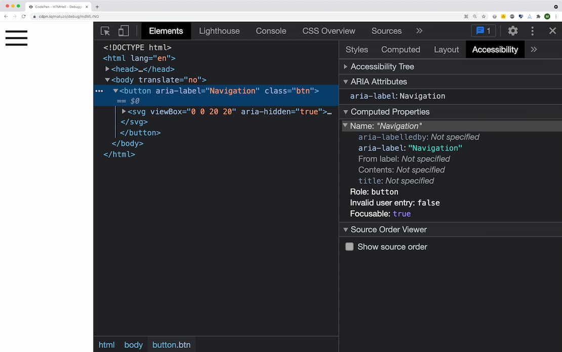
- Label - The button gets its label “Navigation” from the
aria-labelattribute (Name: "Navigation") - Semantics - It has a proper button role (
Role: button) - Focus - It’s focusable (
Focusable: true)
<button aria-label="Navigation" class="btn">
  <svg viewBox="0 0 20 20" aria-hidden="true">
    <rect y="3" width="20" height="2"></rect>
    <rect y="9" width="20" height="2"></rect>
    <rect y="15" width="20" height="2"></rect>
  </svg>
</button>
Let’s look at another example. This button looks the same, but it's less accessible.
Button 2
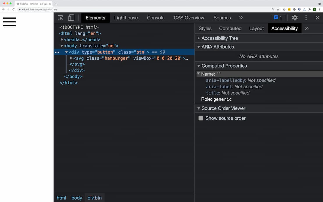
- Label - The button has no label (
Name: "") - Semantics - Its role is “generic” which means that it doesn't have any semantic meaning (
Role: generic) - Focus - It’s not focusable (Missing
Focusableproperty)
<div type="button" class="btn">
  <svg class="hamburger" viewBox="0 0 20 20">
    <g>
      <rect y="3" width="20" height="2"></rect>
      <rect y="9" width="20" height="2"></rect>
      <rect y="15" width="20" height="2"></rect>
    </g>
  </svg>
</div>
Firefox Dev Tools - Accessibility panel
In Firefox, right-click the button and select “Inspect accessibility properties” or open DevTools and click the “Accessibility” tab and find the button in the accessibility tree.
Button 1
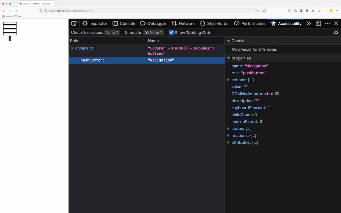
- Label - The label of the button is “Navigation” (
Name: "Navigation") - Semantics - It has a proper pushbutton role (
Role: "pushbutton") - Focus - It’s focusable (the implicit tabindex is 1)
Note 1: Firefox uses a different accessibility API, that’s why the names of roles aren’t the same as in Chrome. pushbutton corresponds to the ARIA role button.
Note 2: You can check if an element is focusable by ticking the “Show Tabbing Order” checkbox. If there’s an outline on the element with a numbered arrow pointing to it, it means that it’s focusable. The number represents the tabindex.
Button 2
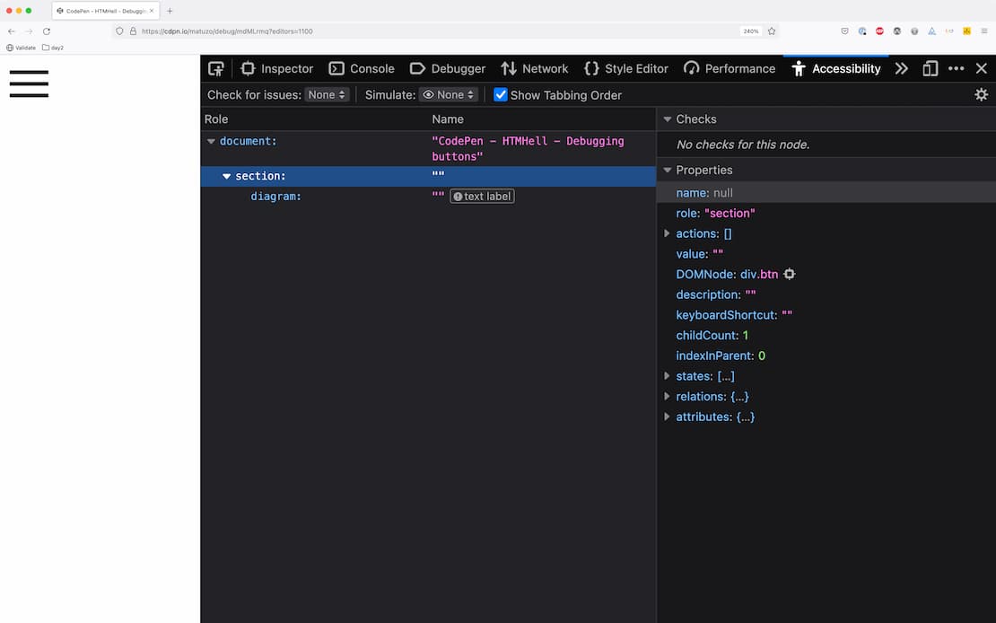
- Label - The button has no label (
Name: null) - Semantics - Its role is “section” which means that it doesn't have any semantic meaning (
Role: "section") - Focus - It’s not focusable (No outline and number when pressing “Show Tabbing Order”)
Note: Just like generic in Chrome, section in Firefox corresponds no ARIA role.
Resources
Did you enjoy this tip?
Sign up for the HTMHell newsletter and receive an HTML tip or trick every week via e-mail.