The Ghosts of Markup Past
by Thomas A. Powell published on
As a well-seasoned web developer, a clear euphemism for my age, I reminisce about the early days of markup through the haze of strong emotional glasses. I see the past from an extreme nostalgic fondness for the simplicity of the time when a basic text editor and the ability to view source was all you needed. Yet it can just as easily go to a secret shame and embarrassment of admitting that we hacked around with invisible pixels, nested tables, and all manner of quirky presentational elements.
This post attempts to map those extremes and the space between them. The ultimate outcome would be to encourage you to personally explore the history of the web to unearth things that could be rediscovered, recycled, or recast for the modern web as well as learn from past mistakes. So let’s get going, and I promise we will tread a path that isn’t as annoying as a scolding about the innovation of the <blink> tag.
Searching for Markup Ghosts
Before we get started with our naughty, nice, and best never spoken again list of markup from years prior let’s take a moment to address the source of these historical gems. There are basically three sources for much of HTML’s early innovation.
- The various proprietary introduced by browser vendors, particularly during the so-called browser wars of the late 1990s. Many of these elements eventually became part of the standard in time.
- The W3C HTML specifications, especially those which didn’t see uptake like HTML 3
- Use case specific markup to support the web on devices like WebTV and early smart phones
Let’s quickly explain each source and provide a brief commentary to temper what you find in our list of markup relics.
Spoils and Victims of the Browser Wars
The browser wars of the late 1990s were mainly a two-way battle between Netscape and Microsoft. They eventually ended with the dominance of Internet Explorer and a period of relative stagnation of web development in the early 2000s. However, during this warring period, we experienced tremendous markup innovation, some excellent, some misguided and some a foreshadowing of the challenges we currently address.
Interestingly, many unusual markup elements and attributes live on from that time so you can use them in your modern browser of choice. Others will require you to find an old browser likely running on an operating system circa that time period. For those we aim to understand the mistake or idea of the markup.
HTML 3 - The Spec That Would Never Be
Another place to mine for interesting thoughts about markup was the ill-fated HTML3 specification. An interesting source for this lost specification was a book by Dave Raggett I still have in my collection. I hope you marvel how for a moment we almost had footnotes (<fn>) for the web, a collection of common dingbats, many more semantic tags, and even relative measurement units in a few places.
The specification is filled with all sorts of interesting tidbit that likely deserves an article series of its own. Alas, most of these lost specification elements never found their way to browsers. You might be interested in them to have a more nuanced view of the time period or even as inspiration for what you might implement as a custom element or web component.
Early Devices - WebTV and More
Lastly, an interesting place to find ancient innovation is to see what was implemented to support WebTV, the first broadly used web appliance. WebTV added many features that will seem familiar in intent to what we do today to support mobile devices. Interestingly, I’ll also briefly talk about the existence and influence of wireless-focused markup in WML (Wireless Markup Language).
Note: If you really want to experience WebTV the best route is to watch videos like this one on YouTube.
The Web Ancients Sometimes Had Wisdom And Sometimes Didn’t
As someone who worked in, taught, and wrote about web tech last century, many things have not only stood the test of time in terms of value, but have largely been reinvented in modern times out of ignorance. I may allude to such points wherever possible, but for now, I present a view of overarching themes we’ll encounter in many places.
Some Best Practices Are Forever
WebTV and Wireless Markup Language (WML) exposed a constraint focused approach to web development that should ring true for best practices and performance minded developers today. For example,
WebTV encourages that pages should be smaller than 250K
Source: WebTV Developer’s Guide
Apparently they wanted you to consider a performance budget. The also encourage developers to use simple forms, write concise text, and test on the actual hardware! Hmmm…apparently good advice is quite timeless!
Encourage Medium Restriction
The constraints of device based Web at the time was quite severe. To address this WebTV both encouraged developers with advice like
…WebTV-based systems in North America and Japan (both use the NTSC television standard) display Web pages in a fixed 544 x 372 screen space. Pages may scroll vertically but not horizontally. Pages that are wider than 544 pixels will be scaled to fit that width.
We should acknowledge that the idea of scaling pages is not dissimilar to what we do to address phones these days with appropriate <meta> viewport, relative measurements, and responsive design.
Convert and Constraint the Rest
Besides encouraging developers to do the right thing, many web capable devices of that time period relied upon converting proxies to convert unsupported content. For example, WebTV would transform frames into equivalent layouts using tables and transcoding images for more performant situations. These folks weren’t the first doing such things AOL had already been doing it for years when they started gatewaying to the open Internet.
The TV-based web wasn't the only place where device constraints and conversion thinking were employed. Early smart(er) feature phones often did cellular carrier-level conversions. You'll also see that an HTML subset/superset in strict XML was popular in the late 90s and early 2000s called WML. WML’s strictness was required because implementing a permissive and sprawling browser on the phone wasn't feasible. This markup language adopted a different, less page-oriented mindset, opting for a <card> style metaphor to allow users to move through screens. Many of these ideas would seem not too dissimilar to Google's AMP (Accelerated Mobile Pages), implemented nearly two decades later.
Let’s Go Already
So enough of the broad themes, let’s get going already and I promise I won’t throw too many random things like the fun fact that WebTV supported something called JellyScript which was their version of JavaScript! Sure it sounds weirdly tasty, but it’s time to get to the list of arcane markup.
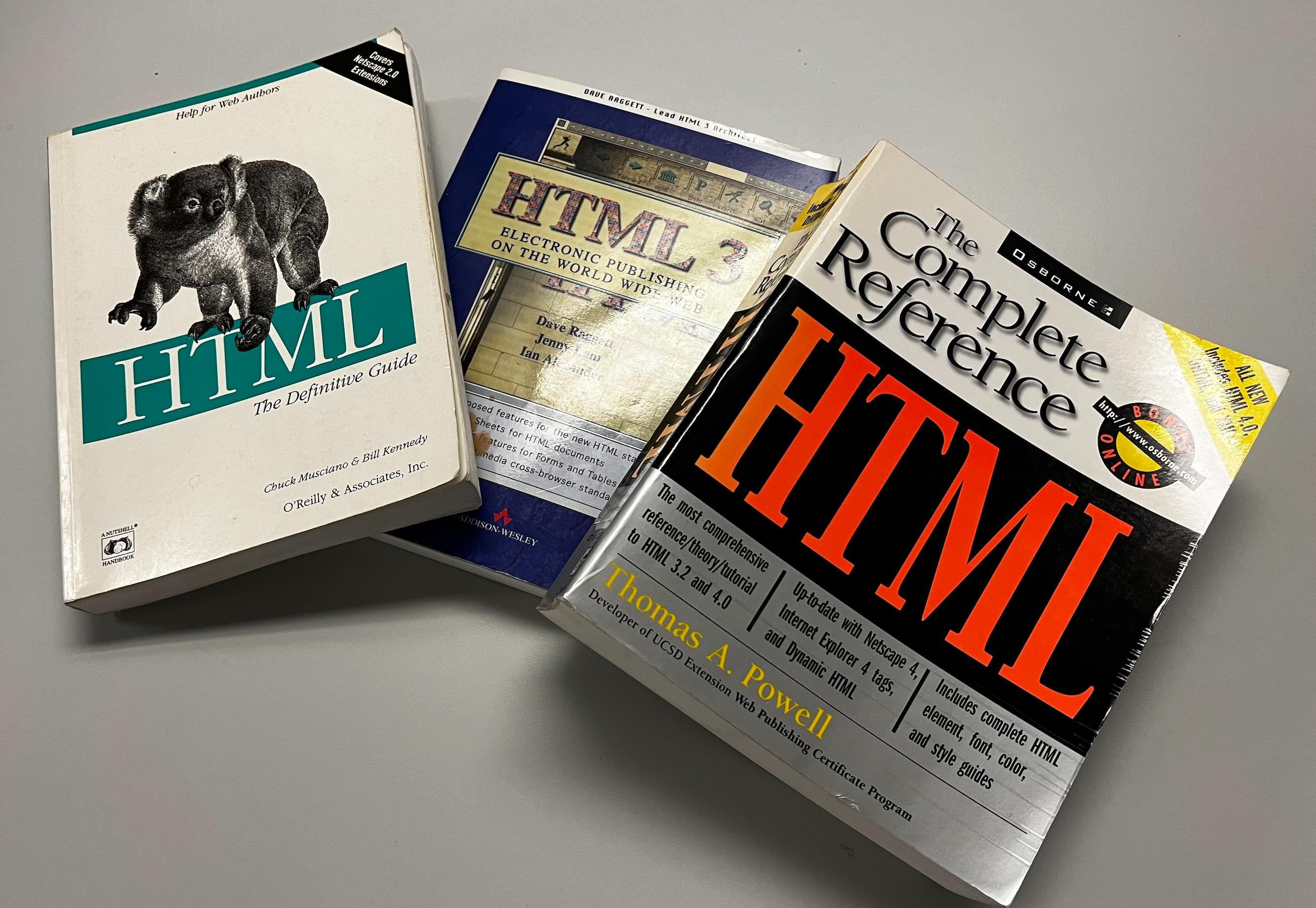
Note: Much of this content comes from my personal collection of books from the time period, including my own books like HTML: The Complete Reference.
Where possible, I try to reference information via archive.org, but some are lost to time and poor search. This is not an excuse, but it reminds us of the sad state of online information preservation. Because of this, I must admit to relying on my error-prone human memory. If you, too, were present during this time and have corrections or better pointers to active resources, please add them to the comments below.
My Incomplete List of Arcane Markup
<audioscope> dance party - WebTV introduced a graphical display of a current playing sound over time. Yes, that is an odd description. Maybe watch this YouTube video to get the idea of something you’d be hard-pressed to experience today.
<au> for authors - This HTML 3 semantic element was used to set the page author’s name like so <au>Thomas A. Powell</au>. Not a bad element, but the name was certainly not gold, I would prefer something like <author> if we are going to revive it.
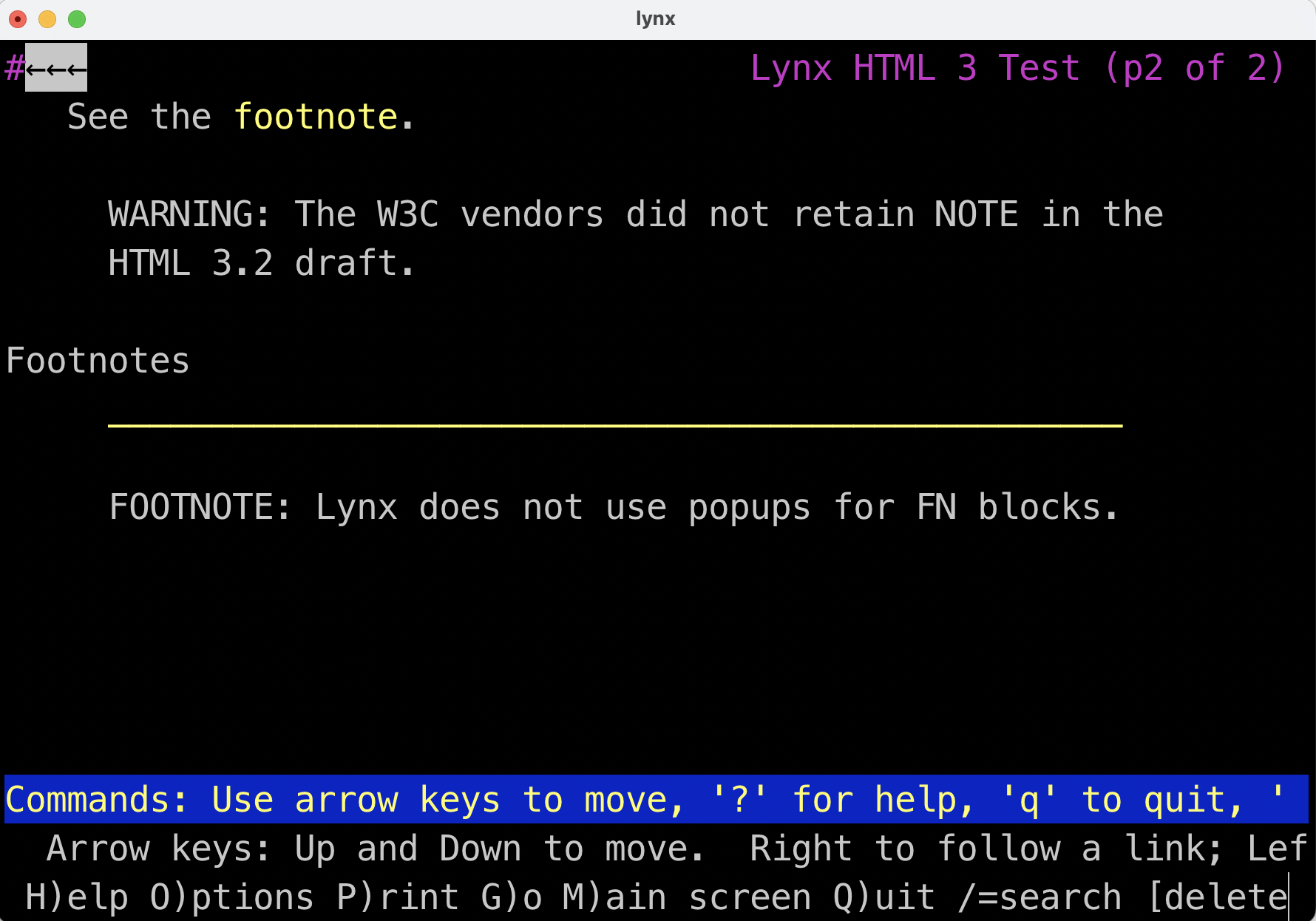
<banner> useful and unimplemented - This was an unimplemented HTML 3 element to display a non-scrolling region at the top of a page like <banner>Check out our new tags!</banner>. Such things are done today with a <div>, other semantic block elements, or even a web component. Interestingly these and other elements from HTML3 will work in the Lynx browser!
<bgsound> be gone - This Internet Explorer introduced element allowed for Midi, Wav, and other audio format files of the time to be played on a page background and even looped. Why link to a video when you can <bgsound src="never-gonna-give-you-up.wav" loop="infinite"> an unsuspecting visitor. The best part of this ancient Rick Roll is that you can’t modify the volume level or stop the playback. You’d think they’d blast that tag if only they had Devtools, which came years later with Firebug and eventually native browser tools. Today, we have <audio> if you must perform such a gag on your friends or enemies.
<blackface> NSFW? - A WebTV addition used to set double-weight boldface. This jargon is from typographical tradition, but an article-skimming reader might worry about racial insensitivity. It's here as a warning that markup is a language, too, and as such, beliefs and norms can and do change. It’s a good thing nobody uses this platform or element anymore!
<blink> returns? - The tag so many love to hate and one of the few relatively possibly degradable tags that got fully deprecated. Don’t worry though, if you pine for the old days just add a custom element and emulate away!
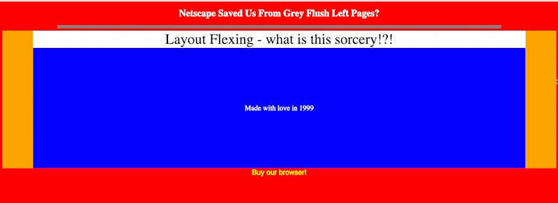
<body> attribute bonanza - Netscape, Microsoft, WebTV, and even very esoteric browsers like Oracle's proprietary browsers threw all sorts of attributes on the <body>, from common things like setting background colors (bgcolor) and images (background), to lesser-known attributes on WebTV to define page credits, logos, background attachment, link colors, scroll speed, margins, and more. This element always required significant revisions for each edition of my book as it was in constant flux. Most of the color and basic layout features still work, so don't be surprised if you spot some of these attributes in the wild today. (Demo)
<center> evil and easyThe <center> tag was a powerful tool back in the day. For modern web devs who have fought floats, auto, flex, and finally reached a simple solution with CSS grid it almost feels like we are back to where we started.
Color attributes galore - Devs broadly chanted “Grey grey, grey go away, bring us color every day!” when Netscape introduced color for the page on <body> with bgcolor and text, tables, and for the <font> tag. Understand that Netscape, not Microsoft, was initially responsible for a significant amount of the presentational ideas mixed into HTML. Don't blame them too much, the developers of the time really wanted them!
Data binding had promise - Starting with IE4 the idea of data binding was introduced via the datasrc attribute to point to a data source to populate into a tag like <table datasrc="URL of data">. For example, we might use this technology to point at a data source or an internal data island using Microsoft’s <xml> tag to embed some non-rendered data in a page not too dissimilar to how <script src="some-other-type"> or <template> is used today for creating data islands. Once data was fetched, then the table rows would be dynamically rendered.
To implement data binding, output control is needed, so various tags such as table cells (<td>), <div>, and <span> were extended in Microsoft browsers to support a datafld attribute to select the field and the dataformatas to specify to treat the retrieved content as text or HTML.
Today, this form of client-side data binding is broadly implemented using JavaScript frameworks. Still, using web components, you could certainly implement a modern form of data binding even with remote REST sources. We implemented this very thing in my product ZingGrid, and I have observed many people employing similar ancient IE-like data binding ideas themselves. The concept clearly was useful, just too early.
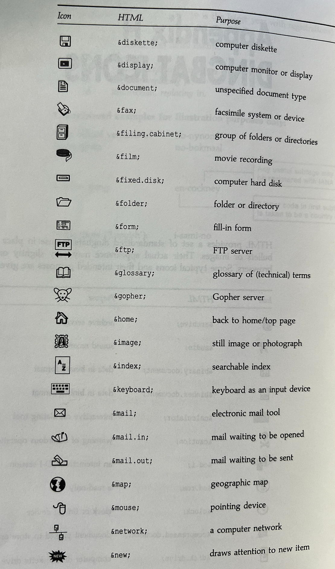
Dingbat icons - HTML 3 had a very interesting concept to have HTML provide a standard set of dingbats that could be included in pages. Between emojis, extended Unicode entities, icon fonts and scalable SVGs we handle this quite differently today, but back then we might have had &new; to insert a small new icon or a clock icon with &clock; and so on. Interestingly many HTML 3 elements supported the dingbat attribute such as <ul dingbat="new">.
A funny thing is just how time period these were as they include binhex files, diskettes, CDs, 3270 terminals, and even a Gopher server! Take a look at the figure to see some examples from the HTML 3 book.
<font> had more - A <font> tag is up there in terms of elements people frown upon, but at the time, it really was the only choice we had unless we wanted to put text in an image! The syntax isn’t that unfamiliar to many, but you might be surprised besides the face, color, and size attributes we saw in WebTV effects like emboss, shadow, and transparency. Furthermore, from Netscape 4.x and Internet Explorer 4.x we had custom font support. Albeit, it was using odd formats and wasn’t ready for use. Before we got to the custom fonts we enjoy today, things got even worse using hacks with Flash like SiFR. Today all these approaches to typefaces on the web have been thrown in the dustbin of history where they belong.
Footnotes almost happened - Footnotes are still missing from HTML today which is pretty odd considering the amount of academic content we put online. Obviously you can simulate such a construction, but HTML 3 provided the <fn> tag like <fn id="arcance_markup">The Ghosts of Markup Past</fn> and link to it as you might any standard target. While the element name isn’t great this probably deserves a revisitation in future HTML explorations.
Form fields for devices - Many changes (<input>, <textarea> and more) for non-computer browsers - WebTV foreshadows how data entry on a device other than a standard computer can be difficult. The device supported a showkeyboard attribute to help you enter data most notably useful for <textarea> and eerily predictive of today's inputmode and others for assisting form fill-out on mobile. WebTV also experimented with attributes to format (allcaps and autocaps), avoid interactions (autoactivate and autosubmit) and various controls to fit the display such as color and images for fields.
<frameset> and <frame> - Sure, Jakob Nielsen’s famous screed Why Frames Suck (Most of the Time) from 1996 scared many off from this feature which was actually part of the W3C HTML 4 specification. They still secretly work in almost every browser and when leveraged properly exhibit better performance and usability than most modern JavaScript solutions. Interestingly, a fallback with <noframes> has always been available. Do you dare explore them? I hope not.
<iframe> - What’s this known element doing on the list? Well, believe it or not, at first, this was the non-standard element not <frameset> and <frame> which are in the specification. Initially introduced by Microsoft IE3 this element avoids deprecation because of its containment usage, but a fun arcane fact is that it wasn't officially part of a markup standard until HTML5!
<img lowsrc> for slow loading images - Many browser vendors implemented the lowsrc attribute to display an image first as the main one loads. Today we reinvent this and call them low-quality image placeholders (LQIPs) executed with JavaScript and CSS. Sometimes the old ways should have lived on!
<img dynscrc> to support animations and movies - Somehow predicting the return of animated GIFs or movies instead of images, Microsoft and WebTV supported the dynsrc attribute to load a dynamic asset as opposed to a static image. You could add playback buttons with the controls attribute. The desire to improve <img> to support videos to avoid the performance abuse of animated GIFs is an open topic today. The dynsrc attribute is yet another old idea that might have helped us out of our current troubles.
<input type="scribble"> was a weird idea - HTML 3 really got innovative, if that is the appropriate word when proposing this extension to <input>. It’s not as if that element isn’t already overloaded, but there was the idea of <input type="scribble" src="chart.gif" value="Annotate this chart"> which, as the example implies, would allow you to scribble on the image. Oddly, the value attribute wasn’t for instructions but rather described fallback text. The whole thing seems extremely under-specified and was never implemented, like most of the new elements introduced by HTML 3.
<layer> might be a relief from<div> every since anyway. Oh and don't forget <ilayer> it's lesser known relative tag for inflow positioning. These elements certainly didn’t live on, but I am sure if you wanted to simulate them with a custom element you could! Please don’t, really don’t.
<link> power unrealized - HTML 3 had common ideas like loading a stylesheet setting document relationships (next), but it also appears they had a limited inclusion format. For example, you could keep an external message in a file referenced on pages like so <link rel="banner" href="announcement.html">. This tag touches on the need for native fragment inclusions within HTML that has yet to materialize, but I still hold out hope that someday they might.
Lists had images and more - HTML 3 proposed the use of dingbats and images on many tags, most notably unordered lists (<ul>). The idea was you could both set an image <ul src="images/star.gif"> as well as a dingbat (<ul dingbat="new">). The WebTV platform wasn’t nearly as aggressive with its special list features, but it added support for <ul type="triangle">. Why you might ask? Simple, CRT monitors of the day were so low resolution that a circle and square bullet type pretty much looked the same at small size!
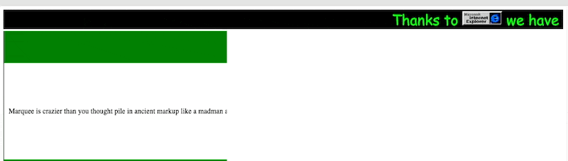
<marquee> lives on - Microsoft’s response to Netscape’s <blink> is actually quite involved and still supported. It is just as annoying, but for some reason doesn't have the same level of hate. There is lots you can do with a <marquee> tag like control the direction, the repeat, the speed and even use presentational attributes and nest content to keep the 1990s web alive in my silly demo and recall last years advent entry on marquee as well!
maxlines far ahead of its time - The maxlines attribute was added to tags like <td> and others to clip content on a space constrained WebTV display. It's a great example of ideas like content clipping and overflow that didn't come to CSS until much later, but interestingly were present in some corners of early web dev.
<multicol> a bad idea then and now - Unless you kept fixed to the viewport a multiple column layout is quite a bad idea usability wise. It certainly didn't stop us from implementing multiple layout natively in CSS! The element had basic attributes to control columns (cols) and spacing (gutter), but like most presentation HTML it was far from enough and CSS wins the day.
<note> should have stayed because we make these anyway - One of my personal favorites in HTML 3 is the callout ideas using a note element. The role of the note referred to often as admonishments was set by the class attribute defining the role of the enclosed text. For example, <note class="warning">None of these tags were implemented</note>.
The written record suggests that “HTML 3 aims to provide the author with ready-made styles for purpose" so there clearly were different thoughts about class use than we have today. If you really must explore this Lynx does support it as you can see here as well as the previously mentioned footnote (fn) element.
<person> yet another semantic element - Another HTML 3 semantic addition this element might be used to define an index of people, maybe for a directory like so <person>George Washington</person>. Seems like this is better handled by a <meta> element or micro-data using a data-* attribute, but the intention seemed roughly correct. Using a rel attribute on <a> is another approach to personal data and is covered in a great entry from last year's calendar.
<select> early innovations - Making menus with <select> has been the thorn in the side of many web developers to this day. Interestingly the web ancients had thoughts. First, WebTV solved a problem we still face and solve with JavaScript via a showempty attribute to handle an empty select list and a default message. Second, HTML 3 even wanted to include images and shapes in menus with some odd image map like construct. It's not worth explaining something so utterly bonkers, but it does make me wonder if the upcoming <selectlist> will really be any better?
<sidebar> it’s like frames, but easier - WebTV had lots of limitations and they were quite creative with how they addressed them. The <sidebar> element allowed you to pin a non-scrolling region to the left side of the screen. Obviously useful for navigation bars and the like, it was in some sense a way to have a frame like experience when they couldn’t support frames.
<shadow> emerges - Before CSS introduced them, you could make a text shadow at least on WebTV without using an image. This <shadow>drop</shadow> example would drop a small black shadow down and to the right on that platform. Clearly something that doesn't belong in markup, but a fun lesser known example of ancient presentational HTML.
<spacer> made layout hacks easy - When Creating Killer Web Sites why add an invisible pixel to your page? Netscape 4 innovates a tag <spacer type="block" width="100" width="100"> that does just the same!
<tab> or spaces please no for HTML - This element will make your presentation mixed into semantic markup warning meter go to 11. HTML 3 proposed that we have <tab>, <tabstop> and even <tab to t8> which was some weird attribute without an assignment to get to a particular tab level. It even had an align attribute to tab from different directions. I acknowledge that layout on the web was hard in the early days, but revisiting this "solution” was even was probably the worst part of my markup historical tour.
<table> Layout Simplicity? - Many modern web developers will clown on the idea of using tables stacked or nested as some ancient way as they nest <div> tags like fiends. Interestingly it was quite possible using a combination of relative units in percentage and fixed values to provide variable flexible layouts. Add in some colors and rudimentary alignment with <center> and more and away you go. Try the demo and resize it. I used upper case and more to have some real 1990s fun that still works in your browser.
Transitions - Both WebTV and Microsoft Internet Explorer had some interesting thoughts about inter-page transitions. While Microsoft used a very strange ActiveX powered mechanism for filtering and transition effects, WebTV’s syntax was a simple as <a href="page" transition="slideleft">Load Page</a>. If you squint hard, you'll see the emerging MPA transitions ideas from the View Transitions API being played with almost 25 years ago!
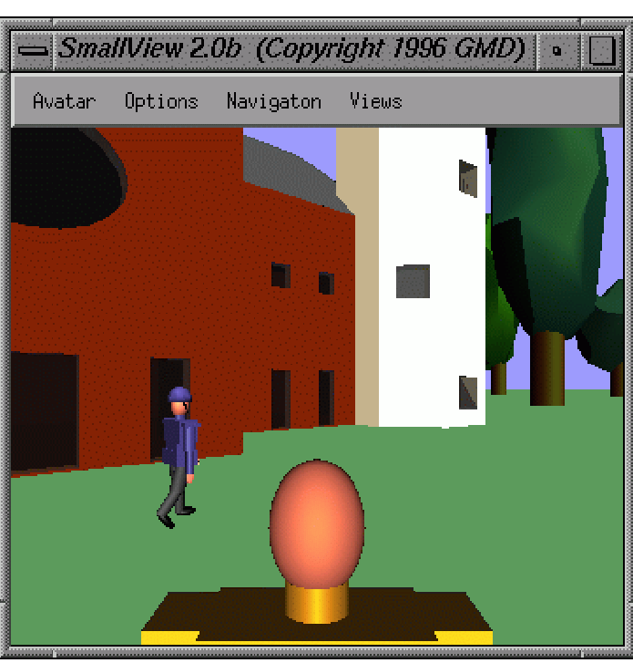
VRML - To round out this list, let us reminisce about VRML(Virtual Reality Markup Language). Being that I am associated with UC San Diego, which is significantly responsible for this technology, I can bear some sliver of responsibility for this technology. I only conclude our list with this technology as it seems appropriate with the recent introduction of <model> and likely many more ideas like WebXR that will become real with the arrival of the Apple Vision Pro. The past really did predict the future, albeit at a much lower rez!
Back to the Markup Future?
There’s a lot more I could have revealed in this historical markup tour including hacking with expected HTML bugs documented in my book as well as others, various interesting HTML 3 ideas with checksums, list control, and even incredibly esoteric browsers with their special elements. The point of this list was to expose enough of the ancient ideas to help us get ready for the future.
As a language, HTML really isn’t done as languages rarely finalize. However, it’s been stagnating for some time. Looking at the new things landing in the last year or two, clearly, this is no longer the case, and it is nearly certain we will see many new markup elements this decade. Some are in the pipeline due to new devices, emerging web access modes such as AR and VR, and the desire to standardize UI elements via (open-ui.org). However, if market competition heats up due to browser-related regulatory action, you can almost guarantee we will see a back-to-the-future moment in web technology with all sorts of new features introduced as browser vendors try to capture or retain market position. Hopefully, these arcane blasts remind you that this has all happened before, and it will happen again and again and again…
About Thomas A. Powell
Thomas A. Powell has been earning his living building internet and later web services since 1991. Still far from retiring he continues to poke away at web tech as the owner of a web agency (pint.com), teaching web development and software engineering for the UC San Diego Computer Science department, and building developer libraries such as ZingChart, ZingGrid, and the upcoming ZingViz. Reach out to him on Mastodon at @thomasapowell@fosstodon.org or email at tpowell@pint.com to talk about the web past, present or future.
Mastodon: @thomasapowell@fosstodon.org